Creating Interactive Graphs with Altair
Interactive graphs allow users to interact with data while experiencing dynamic features of the visualization. These graphs deepen understanding of data, aiding in pattern recognition and information extraction.
Interactive graphs can include various types of interactions:
- Zoom In/Out: Enlarge or reduce the graph area to examine details more closely.
- Drag: Move or select specific areas of the graph by dragging.
- Selection: Click or drag to select specific data points. Additional information about selected data points may be displayed.
- Filtering: Filter data points based on specific criteria to display or hide them.
- Tooltip: Hover over data points to display additional information via tooltips.
- Multi-selection: Select multiple data points simultaneously and display related information together.
Interactive graphs are used in dashboards, data analysis reports, web applications, and various other contexts. They serve as essential tools in data science, business intelligence, and data visualization fields.
Example)
import altair as alt
import pandas as pd
import numpy as np

# Create sample data (샘플 데이터 생성)
np.random.seed(42)
ages = np.random.randint(18, 70, size=200)
purchase_amounts = np.random.randint(100, 1000, size=200)
genders = np.random.choice(['Male', 'Female'], size=200)

data = pd.DataFrame({
    'Age': ages,
    'PurchaseAmount': purchase_amounts,
    'Gender': genders
})

# Create Altair graph (그래프 생성)
brush = alt.selection(type='interval')
click = alt.selection_multi(encodings=['color'])

points = alt.Chart(data).mark_point().encode(
    x='Age:Q',
    y='PurchaseAmount:Q',
    color=alt.condition(click, 'Gender:N', alt.value('#FFD700'), scale=alt.Scale(domain=['Male', 'Female'], range=['#FFD700', '#87CEEB'])),  # Highlight (선택된 데이터 강조)
    tooltip=['Age', 'PurchaseAmount', 'Gender']
).add_selection(
    brush
).add_selection(
    click
).properties(
    width=600,
    height=400
)

bars = alt.Chart(data).mark_bar().encode(
    y='Gender:N',
    color=alt.condition(click, 'Gender:N', alt.value('#FFD700'), scale=alt.Scale(domain=['Male', 'Female'], range=['#FFD700', '#87CEEB'])),  # Highlight (선택된 데이터 강조)
    x='count():Q'
).transform_filter(
    brush
).transform_filter(
    click
).properties(
    width=600
)

chart = points & bars  # & 연산자로 두 개의 차트를 겹쳐서 표시

chart
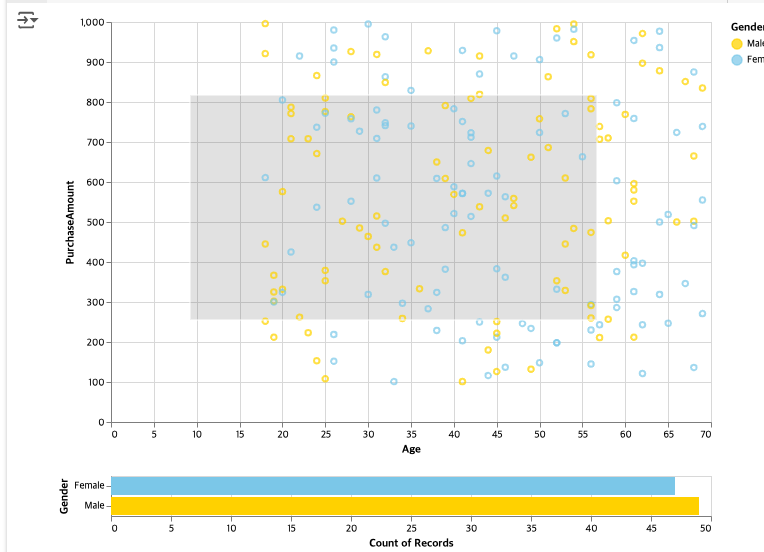
Result 1

Result 2

Result 3

'Study Note > Python' 카테고리의 다른 글
| Machine Learning [scikit-learn] practice (0) | 2024.06.04 |
|---|---|
| pygwalker (0) | 2024.05.30 |
| Multiple graphs (0) | 2024.05.30 |
| Dual-axis graph and Pyramid graph (0) | 2024.05.30 |
| Join, Merge, Concat, Append, and Pivot table (0) | 2024.05.23 |


