When using Python, in addition to basic functions, we need to utilize various libraries. Especially, Pandas, Seaborn, Matplotlib, and Numpy are the most essential libraries when performing data analysis.
1. Pandas:
- Purpose: Pandas is used for data manipulation and analysis. It provides data structures to efficiently store and manipulate data. Its main data structures are Series (a one-dimensional array) and DataFrame (a two-dimensional table-like data structure).
- Features:
- Reading and writing data (CSV, Excel, SQL, etc.)
- Data manipulation and transformation (filtering, grouping, merging, etc.)
- Handling missing data
- Plotting data from DataFrames and Series for visualization
2. Seaborn:
- Purpose: Seaborn is a statistical data visualization library. It extends the functionality of Matplotlib to create statistical graphics and aesthetically enhance them.
- Features:
- Various types of plots (scatter plots, histograms, box plots, etc.)
- Visualization of data distributions (kernel density plots, violin plots, etc.)
- Visualization of linear relationships (scatter plots with regression lines)
- Managing multiple plots and subplots
3. Matplotlib:
- Purpose: Matplotlib is the fundamental plotting library in Python. It is used to create a wide range of graphs and plots. It is often used in conjunction with Seaborn and Pandas.
- Features:
- Support for various plot types such as line plots, scatter plots, bar plots, histograms, etc.
- Fine-grained control over plot styles and attributes
- Support for multiple axes and subplots
- Customizable plot and graph creation
4. Numpy:
- Purpose: Numpy is a library for scientific and mathematical computing. It is used for handling multi-dimensional arrays and matrices, making it essential for scientific and engineering computations.
- Features:
- Creation and manipulation of multi-dimensional arrays
- Various mathematical operations such as linear algebra, statistics, numerical computation, etc.
- Broadcasting and vectorized operations
- Efficient data slicing and indexing capabilities
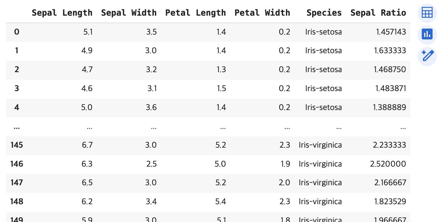
Today, I used with these libraries to retrieve the iris dataset and explore it.
import pandas as pd
url = 'https://archive.ics.uci.edu/ml/machine-learning-databases/iris/iris.data'
columns = ['Sepal Length', 'Sepal Width', 'Petal Length', 'Petal Width', 'Species']
iris = pd.read_csv(url, header=None, names=columns)
iris

iris.describe()

#result

Sepal Length	Sepal Width	Petal Length	Petal Width	Sepal Ratio	Petal Sum
count	150.000000	150.000000	150.000000	150.000000	150.000000	150.000000
mean	5.843333	3.054000	3.758667	1.198667	1.955144	4.957333
std	0.828066	0.433594	1.764420	0.763161	0.398697	2.507662
min	4.300000	2.000000	1.000000	0.100000	1.268293	1.200000
25%	5.100000	2.800000	1.600000	0.300000	1.551915	1.800000
50%	5.800000	3.000000	4.350000	1.300000	2.032292	5.650000
75%	6.400000	3.300000	5.100000	1.800000	2.224910	7.000000
max	7.900000	4.400000	6.900000	2.500000	2.961538	9.200000
Pivot
pivot_iris = pd.pivot_table(iris, values=['Sepal Length', 'Petal Length'], columns='Species', aggfunc='mean')
Added Sepal Ratio
iris['Sepal Ratio'] = iris['Sepal Length'] / iris['Sepal Width']

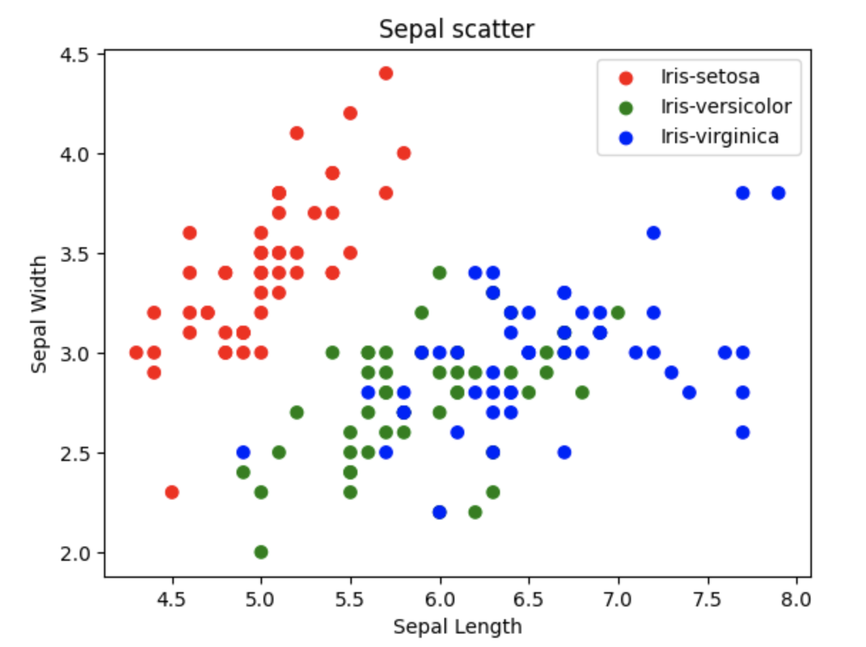
Scatter with colour
At first, creating a scatter plot was a bit challenging. By default, when I created the scatter plot, it didn't separate by 'Species'. I wanted to assign colors to each Species. Then I discovered color_mapping. I created color_mapping and assigned colors to each species, then added it to plt.scatter. It was challenging, but I got the desired result
import matplotlib.pyplot as plt

color_mapping = {'Iris-setosa': 'red', 'Iris-versicolor': 'green', 'Iris-virginica': 'blue'}

x = iris['Sepal Length']
y = iris['Sepal Width']
species = iris['Species']


plt.scatter(x, y, c=[color_mapping[spec] for spec in species])
plt.xlabel('Sepal Length')
plt.ylabel('Sepal Width')
plt.title('Sepal scatter')
plt.show()
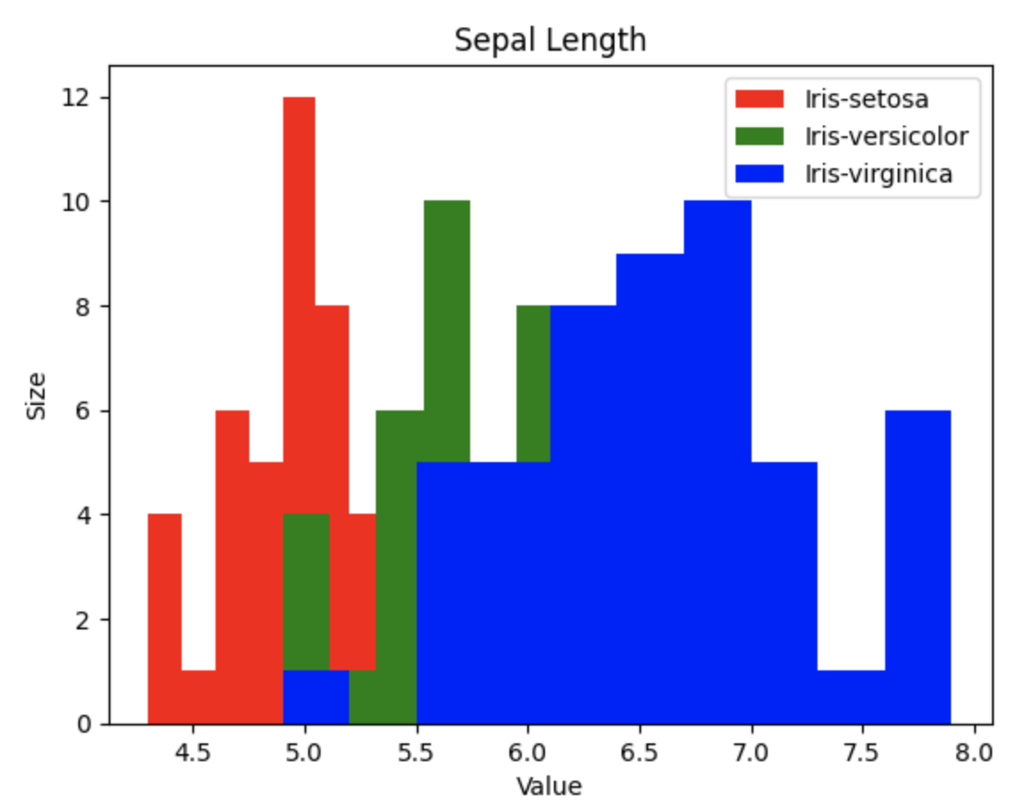
Histogram
I also wanted to add colors to histograms just like creating scatter plots. However, histograms were a bit more complex. I created categories for each species and input them accordingly. The result was a graph that overlays each data point. Although transparency could be adjusted, I did not use it. After researching various sources, I achieved the following result.
color_mapping = {'Iris-setosa': 'red', 'Iris-versicolor': 'green', 'Iris-virginica': 'blue'}

setosa_data = iris[iris['Species'] == 'Iris-setosa']['Sepal Length']
versicolor_data = iris[iris['Species'] == 'Iris-versicolor']['Sepal Length']
virginica_data = iris[iris['Species'] == 'Iris-virginica']['Sepal Length']

plt.hist(setosa_data, bins=10, color='red', label='Iris-setosa')
plt.hist(versicolor_data, bins=10, color='green', label='Iris-versicolor')
plt.hist(virginica_data, bins=10, color='blue', label='Iris-virginica')

plt.xlabel('Value')
plt.ylabel('Size')
plt.title('Sepal Length')
plt.legend()
plt.show()
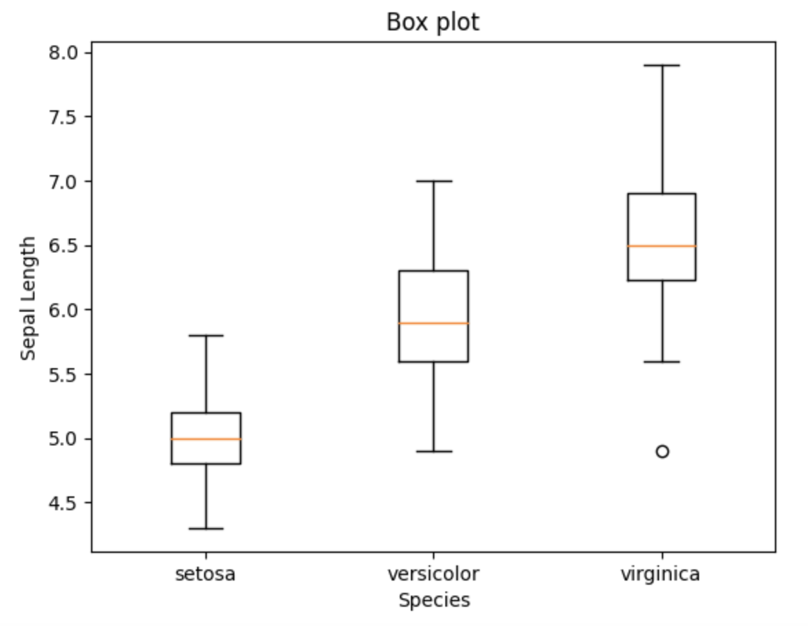
Box plot
plt.boxplot(sepal_length_list, labels=species)
plt.ylabel('Sepal Length')
plt.xlabel('Species')
plt.title("Box plot")
plt.show()
'Study Note > Python' 카테고리의 다른 글
| The difference between deep learning and machine learning (0) | 2024.05.21 |
|---|---|
| Seaborn plot (Scatter, Hist, and Box) (0) | 2024.05.16 |
| Enumerate() (0) | 2024.05.08 |
| Missing data handling (0) | 2024.05.02 |
| Taitanic data analysis (0) | 2024.04.30 |


